Day 3: Component Libraries & Style Guides
I asked Claude to build a user settings page.
It gave me this:
<div style=>
  <h1>Settings</h1>
  <form>
    <label>
      Email:
      <input type="email" name="email" />
    </label>
    <label>
      Password:
      <input type="password" name="password" />
    </label>
    <button type="submit">Save</button>
  </form>
</div>
Technically correct. Functionally useless. This looks nothing like my application. The colors are wrong. The spacing is wrong. The form inputs are plain HTML instead of my custom form components. The button is a basic browser button instead of my primary action button.
This is every developer’s experience asking AI to build UI. You get something that works in isolation but looks like it came from a different application.
Here’s what I learned. AI doesn’t know what your design system looks like unless you show it.
The Problem: AI Generates Generic UI
AI is trained on thousands of public code repositories. When you ask for a form, it gives you what most forms look like across the internet. Generic HTML. Basic styling. Standard patterns.
That’s not what you need. You need UI that matches your application. Your colors. Your spacing. Your component library. Your design system.
The first time I shipped AI-generated UI to production, I spent more time fixing the styling than I would have spent building it myself. Every component needed rework. Colors adjusted. Spacing fixed. Custom components swapped in for generic HTML.
I was using AI to write code, then immediately rewriting the code AI wrote. That’s not productivity. That’s just extra steps.
The Solution: Build a Component Library AI Can Reference
Here’s the fix. Create a reference component library that shows AI exactly what good looks like in your application.
Not documentation. Not a design system PDF. Actual code that AI can read and replicate.
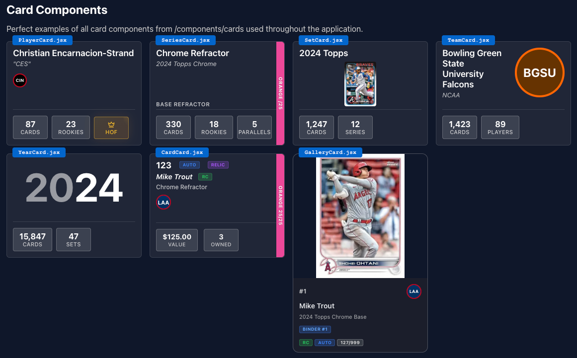
I created a single file to manage my design system. (Seriously, click that link. It’s worth a look.) It’s not part of my application, but I did let it ship to production so I could share it with you.. It’s purely for AI to reference. (See the source code here.)
It includes all of the elements I might use on a page:
- A table for viewing cards
- A table for viewing your collection.
- Card elements to show players, teams, and sets in a concise way.

- Different header elements
- Buttons, and colors, and icons, oh my!
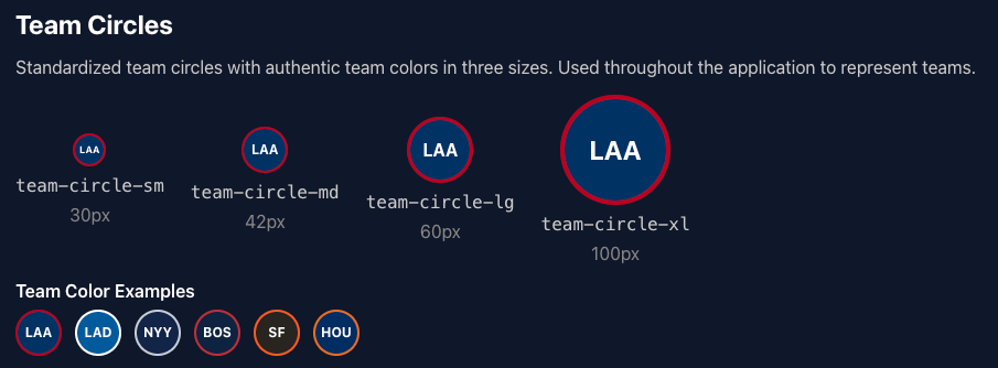
- One of my proudest creations: the “team circle.” It’s an element to show a team without using any of the copyrighted images that are generally associated with a team. They’re used everywhere.

How to Use the Reference Library
When you ask AI to build UI, include this in your prompt:
Build a user profile page with the following features:
- Display user avatar, name, and email
- Form to update profile information
- Button to save changes

Reference /design-system-demo for our design system.
Use existing components (Card, Input, Button, PageContainer).
Match our spacing, colors, and layout patterns.
AI reads your reference file. Sees your components. Understands your patterns. Generates UI that matches.
The Prompt Templates That Work
Template 1: Building with Existing Components
Build [feature] using our existing components.

Reference: /design-system-demo

Requirements:
- Use [component names] from our library
- Follow our spacing patterns (use spacing.md, spacing.lg, etc)
- Use our color tokens (colors.primary, colors.text, etc)
- Match the layout pattern shown in [example component]

Do not create new components. Use what we have.
Template 2: Creating a New Component That Matches
Sometimes you need a component that doesn’t exist yet. AI should create it in the same style.
Create a new [component name] component.

Reference: /design-system-demo

The component should:
- Match our existing component patterns (Button, Input, etc)
- Use our design tokens (colors, spacing, typography)
- Follow our naming conventions
- Include the same props patterns (variant, size, etc)
- Have the same state handling (hover, focus, disabled)

Show me the component code first before using it.
Template 3: Auditing UI Against the Component Library
You have existing UI that doesn’t match your design system. Ask AI to audit it.
Review this component and identify where it doesn't match our design system.

Reference: /design-system-demo

Check for:
- Hard-coded colors instead of design tokens
- Custom spacing instead of our spacing scale
- Inline styles instead of our components
- Inconsistent patterns compared to our reference

List all issues and suggest how to fix them using our existing components.
Real Example: Building a Dashboard
I needed a dashboard with stats cards, a chart, and a recent activity list. Here’s what I asked:
Build a dashboard page with:
1. Four stat cards showing metrics (users, revenue, conversion, growth)
2. A line chart for the last 30 days
3. Recent activity list showing last 10 actions

Reference /design-system-demo.
Use our Card component for stats and sections.
Use our PageContainer for layout.
Follow the grid pattern shown in reference for stat cards.
Use colors.success for positive metrics, colors.danger for negative.
AI generated this:
import { PageContainer } from '@/components/ui/layout';
import { Card } from '@/components/ui/card';

export function Dashboard() {
  return (
    <PageContainer>
      <h1 className="text-3xl font-bold text-slate-900 mb-8">Dashboard</h1>

      {/* Stats grid */}
      <div className="grid grid-cols-1 md:grid-cols-2 lg:grid-cols-4 gap-6 mb-8">
        <Card>
          <div className="text-sm text-slate-600 mb-1">Total Users</div>
          <div className="text-3xl font-bold text-slate-900">12,543</div>
          <div className="text-sm text-green-600 mt-2">↑ 12% from last month</div>
        </Card>

        <Card>
          <div className="text-sm text-slate-600 mb-1">Revenue</div>
          <div className="text-3xl font-bold text-slate-900">$48,293</div>
          <div className="text-sm text-green-600 mt-2">↑ 8% from last month</div>
        </Card>

        <Card>
          <div className="text-sm text-slate-600 mb-1">Conversion Rate</div>
          <div className="text-3xl font-bold text-slate-900">3.24%</div>
          <div className="text-sm text-red-600 mt-2">↓ 2% from last month</div>
        </Card>

        <Card>
          <div className="text-sm text-slate-600 mb-1">Growth Rate</div>
          <div className="text-3xl font-bold text-slate-900">24%</div>
          <div className="text-sm text-green-600 mt-2">↑ 4% from last month</div>
        </Card>
      </div>

      {/* Chart section */}
      <Card title="Revenue Trend" className="mb-8">
        <div className="h-80">
          {/* Chart component here */}
        </div>
      </Card>

      {/* Recent activity */}
      <Card title="Recent Activity">
        <div className="space-y-4">
          {activities.map(activity => (
            <div key={activity.id} className="flex items-center gap-4">
              <div className="text-sm text-slate-900">{activity.description}</div>
              <div className="text-sm text-slate-500 ml-auto">{activity.time}</div>
            </div>
          ))}
        </div>
      </Card>
    </PageContainer>
  );
}
Perfect. Same card style as the rest of my app. Same spacing. Same typography. Same color usage for positive and negative metrics. Same layout pattern.
Zero time spent fixing styling.
When AI Creates Something New
Sometimes AI needs to create a component that doesn’t exist in your reference library. That’s fine. Just tell it to match the pattern.
I asked AI to build a toast notification system. I don’t have toast notifications in my reference library.
My prompt:
Create a toast notification component.

Reference /design-guide-demo for our design system.

Match these patterns:
- Use our color tokens for success/error/warning variants
- Use our spacing tokens for padding and gaps
- Use our border radius (rounded-lg)
- Use our shadow styles (shadow-sm)
- Follow our component prop patterns (variant, size, etc)

Create the component in the same style as our Button and Card components.
AI created a toast component that looks native to my application. Same colors. Same spacing. Same styling patterns. It fits perfectly because AI understood the pattern.
Maintaining the Reference Library
Your reference library isn’t static. When you add new components or patterns, add them to the reference file.
I update mine every time:
- I create a new reusable component
- I establish a new pattern
- I change design tokens
- I find AI consistently getting something wrong
The reference library grows with your application. It’s living documentation that AI actually uses.
Why This Works Better Than Documentation
I tried writing design system documentation for AI. A markdown file explaining our colors, spacing, component usage.
AI ignored it.
Not intentionally. It’s just that documentation describes things. Code shows things. AI is better at reading code than reading prose.
When I switched to a reference component file with actual code, AI started generating consistent UI immediately. It could see exactly what components look like. Copy the patterns. Match the style.
Code is the documentation.
What About Design Tools?
If you use Figma or similar tools, you might have a design system there. That’s great for designers.
While AI can read Figma files, you’re asking it to translate that to the HTML you want. If you have raw HTML examples for your agent to work from, you no longer need to rely on that translation.
Your reference component library is your design system translated into the format AI understands. It’s the bridge between your design system and AI-generated code.
The Difference This Makes
Before I had a reference library, every AI-generated UI component needed rework. Buttons were wrong. Colors were off. Spacing was inconsistent. Forms didn’t match.
I was spending 30-40% of my time fixing styling on AI-generated code.
After creating the reference library, AI gets it right the first time. Maybe 5% of components need minor tweaks. Usually because I didn’t specify something clearly enough.
That’s a 6x improvement in time saved.
More importantly, my application looks consistent. Every page, every component, every interaction follows the same patterns. Because AI is following the same reference I gave it.
Tomorrow
You have a component library that makes AI-generated UI look right. But looking right isn’t enough. You need to know it works right.
Tomorrow I’ll show you how to instrument AI-generated code with observability from the start. The logs, metrics, and traces that tell you whether your code is actually working in production. Because shipping fast is worthless if you don’t know what you shipped is broken.
Try This Today
Create a reference component file for your project. Start simple:
- Create
/design-system(or whatever fits your tech stack) - Add your color tokens with usage comments
- Add your 3-5 most common components (Button, Input, Card, etc)
- Add one layout pattern
- Add comments showing when to use each pattern
Then ask AI to build something simple using that reference. A form. A settings page. A card list.
Watch how much better the output matches your application.
